
Music and snow.
Poke my eyes out
Perhaps your immediate response is: ”I’d rather poke my eyes out with a burning stick than do data analysis.”
There’s a completely different reaction from a lot of people who have experienced data analysis.
Music
It’s not entirely clear why humans like music so much. Part of it may be the guessing game we do. We perceive a pattern in the music and guess where it will go next. One of two things happens:
- we are gratified to be right
- we are surprised to be wrong
We like being surprised and we like being right, and we like the tension of not knowing which it will be. We look for patterns, and patterns within patterns.  That experience of listening to a new piece of music also describes analyzing a new dataset. We create an image of what the data are like; we learn how we are right and how we are surprised. We then form a new image and dive in deeper.
We look for patterns, and patterns within patterns.
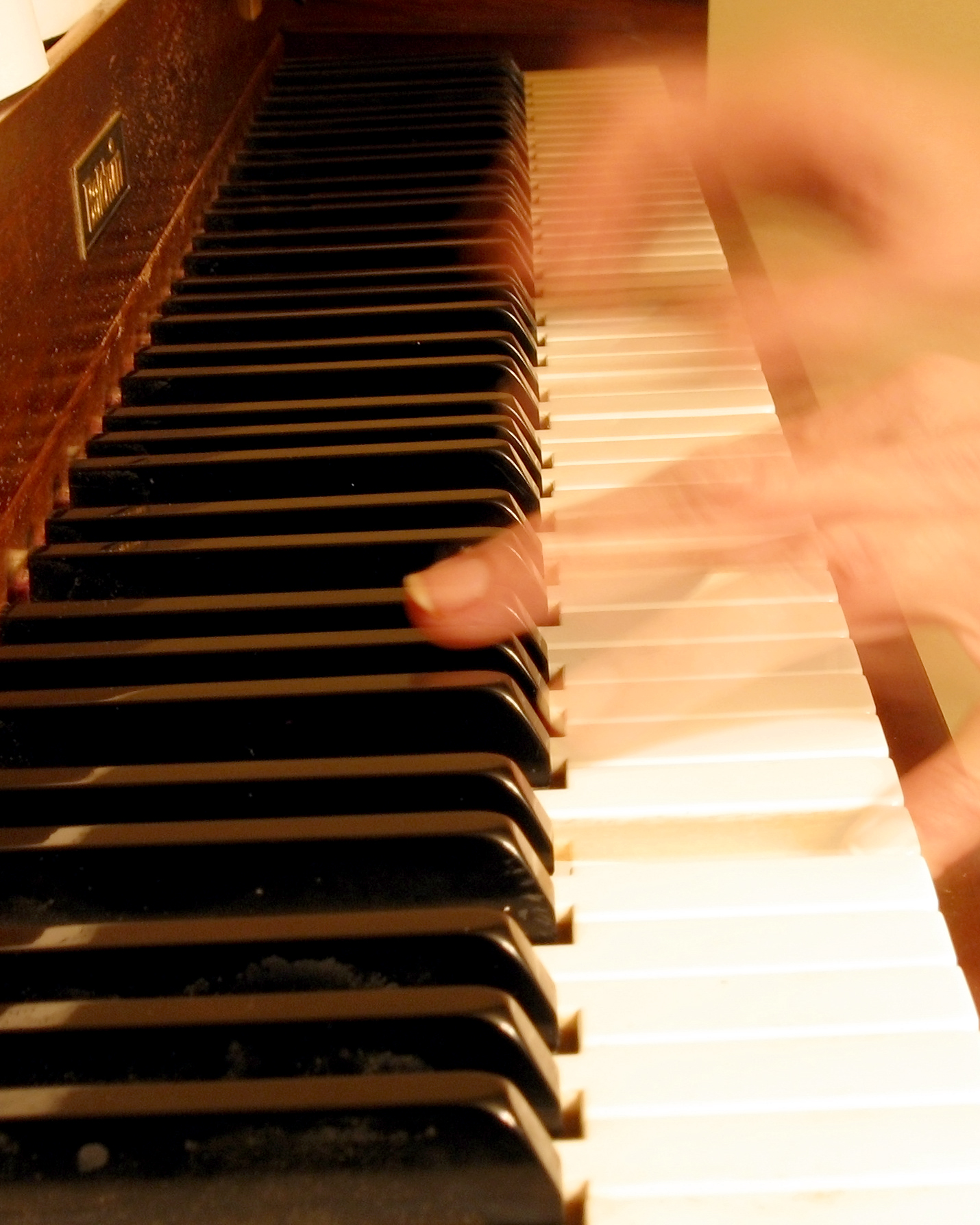
R is the grand piano
Twisting the metaphor beyond recognition, there’s a data analysis instrument that is outstanding at making music. It is called R. There are some technical reasons why R is good. There are also social reasons:
- it is the lingua franca of statistics
- it is rapidly growing in applied data analysis
- there are thousands of contributed packages (as of this writing 4953 in the main repository)
 Oh, and by the way, it’s free.
Sight
The dominant human sense is vision. That means learning — the key component of data analysis — is largely visual. Graphics are important.
In R you can imitate ugly and uninformative graphics as is common in some software.
Figure 3: Ugly and uninformative. 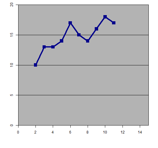 You can also create exceptionally pretty pictures in R, like the Facebook friendship graph (Figure 4).
Figure 4: Strength of Facebook friendship by location. 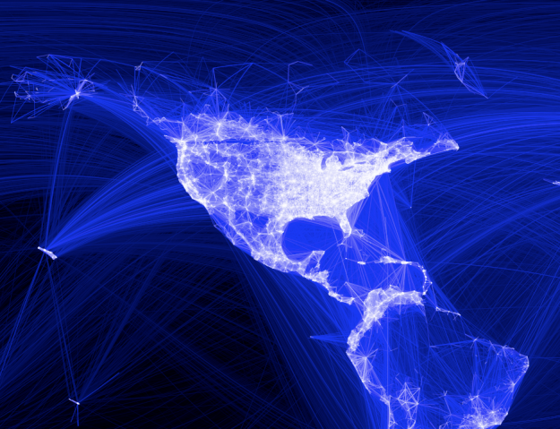 Another possibility in R is to create something beautiful and deeply informative, like the death rate plot (Figure 5) courtesy of Rob Hyndman.
Figure 5: The male to female ratio of death rates in Australia from 1921 (red) through the rainbow to 2009 (purple). 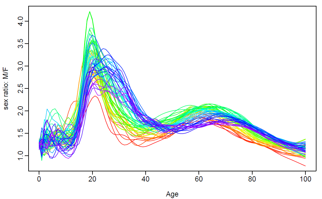 If you were hasty enough to poke your eyes out before you learned that data analysis can be fun, don’t despair. You can also analyze data in R with sound:
- The Play It by R package
- the sound of a tweet
Snow
It’s a thrill to discover something that no one else knows. Data analysis is one of the surest routes to that feeling. It’s like walking through fresh snow that no other creature has touched.  There is a moment to savor after you’ve found something and before others know.
Epilogue
Joy drives the wheels in the great cosmic clock
from ”Ode an die Freude” by Friedrich Schiller
Appendix R
The function that created Figure 3 is:
function (filename = "ugly.png")
{
   if(length(filename)) {
      png(file=filename, width=512)
      par(mar=c(5,4, 1, 2) + .1)
   }
   x <- 2:11
   y <- c(10,13,13,14,17,15,14,16,18,17)
   plot(x, y, xlim=c(0,15), ylim=c(0,20), xaxs="i", yaxs="i",
      type="o", col="darkblue", lwd=4, pch=15, cex=2,
      xlab="", ylab="")
   usr <- par("usr")
   polygon(c(usr[1], usr[2], usr[2], usr[1]),
      c(usr[3], usr[3], usr[4], usr[4]), col="gray70")
   abline(h=c(5,10,15))
   lines(x, y, type="o", col="darkblue", lwd=4, pch=15, cex=2)

   if(length(filename)) {
      dev.off()
   }
}
Photo credits
Flutist in Nepal by blaackhawk via stock.xchng
Fast piano by bornagain via stock.xchng
Snow by ezaqury via stock.xchng
See also
Maybe you were looking for The Joy of Stats.
jun 25, 26
Online Math Degrees has a page of ”100 savvy sites on statistics and quantitative analysis”. It has some that you recognize, some that you’ve hardly ever heard of. The sites [...]
jun 25, 26
R is a piece of software, but it is also a community. Help community The most visible aspect of the R community is help. This is also the most useful [...]
jun 25, 26
Some history and a prediction. Past A discussion broke out on the R-help mailing list in January 2006 about a technical report put out by the statistical computing group at [...]